
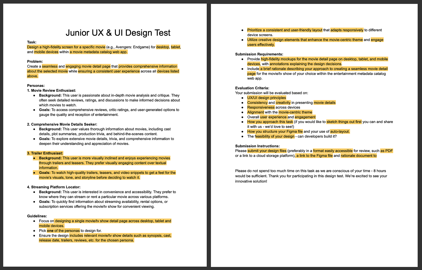
Design Challenge
Role: UX/UI Designer & Applicant
Timeline: 8-hour design challenge
Completed: Dec 2023
The challenge involved designing a responsive movie detail page for desktop, tablet, and mobile that delivers a seamless, visually engaging experience.
Designing for the Trailer Enthusiast persona meant prioritising visual hierarchy, imagery, and clarity to reduce cognitive load and highlight the content they value most.
the brief
The brief asked me to design a responsive movie detail page that clearly presents core metadata across desktop, tablet, and mobile. I was also asked to choose one of three personas with their own background and personal goals to guide the experience.
my approach:
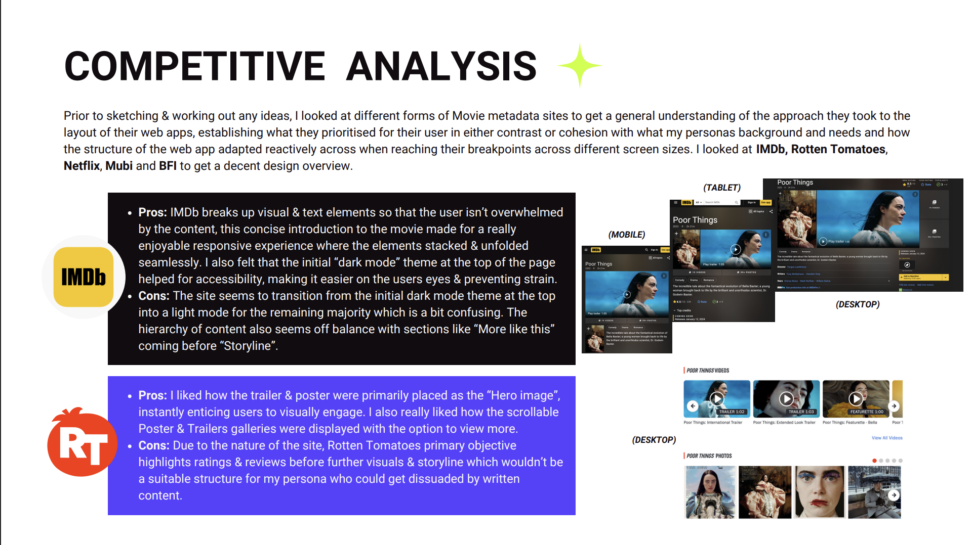
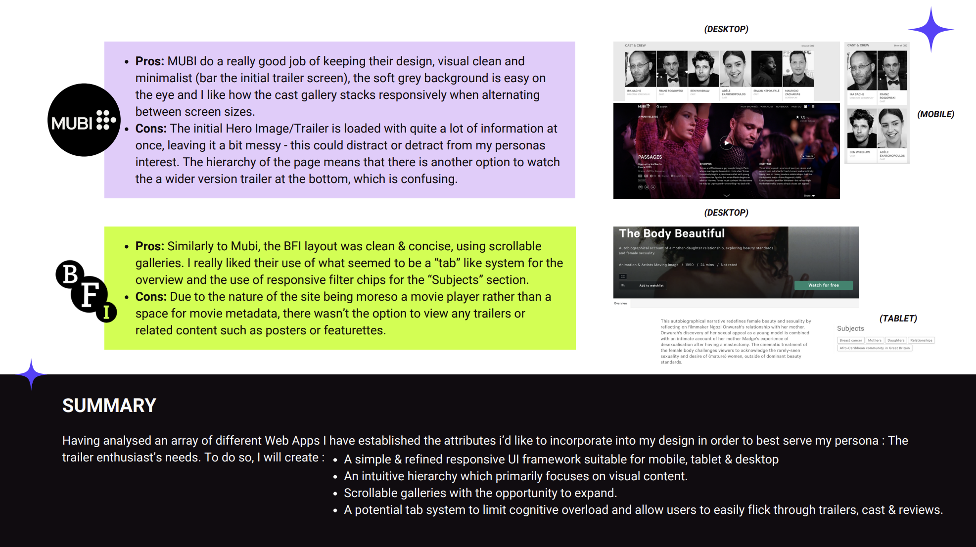
Identified the key requirements for the movie detail page, focusing on clarity, responsiveness, and visual engagement.
Reviewed all three personas and selected the Trailer Enthusiast for their strong alignment with the brief’s emphasis on trailers and visual content.
Defined the primary goals of the experience: reduce cognitive load, structure information clearly, and highlight the elements this persona values most.
Considered how the design should feel consistent with the company’s existing visual tone while still allowing room for creativity.
Set up my Figma file with a clear page structure and responsive layout foundations to support efficient iteration across desktop, tablet, and mobile.
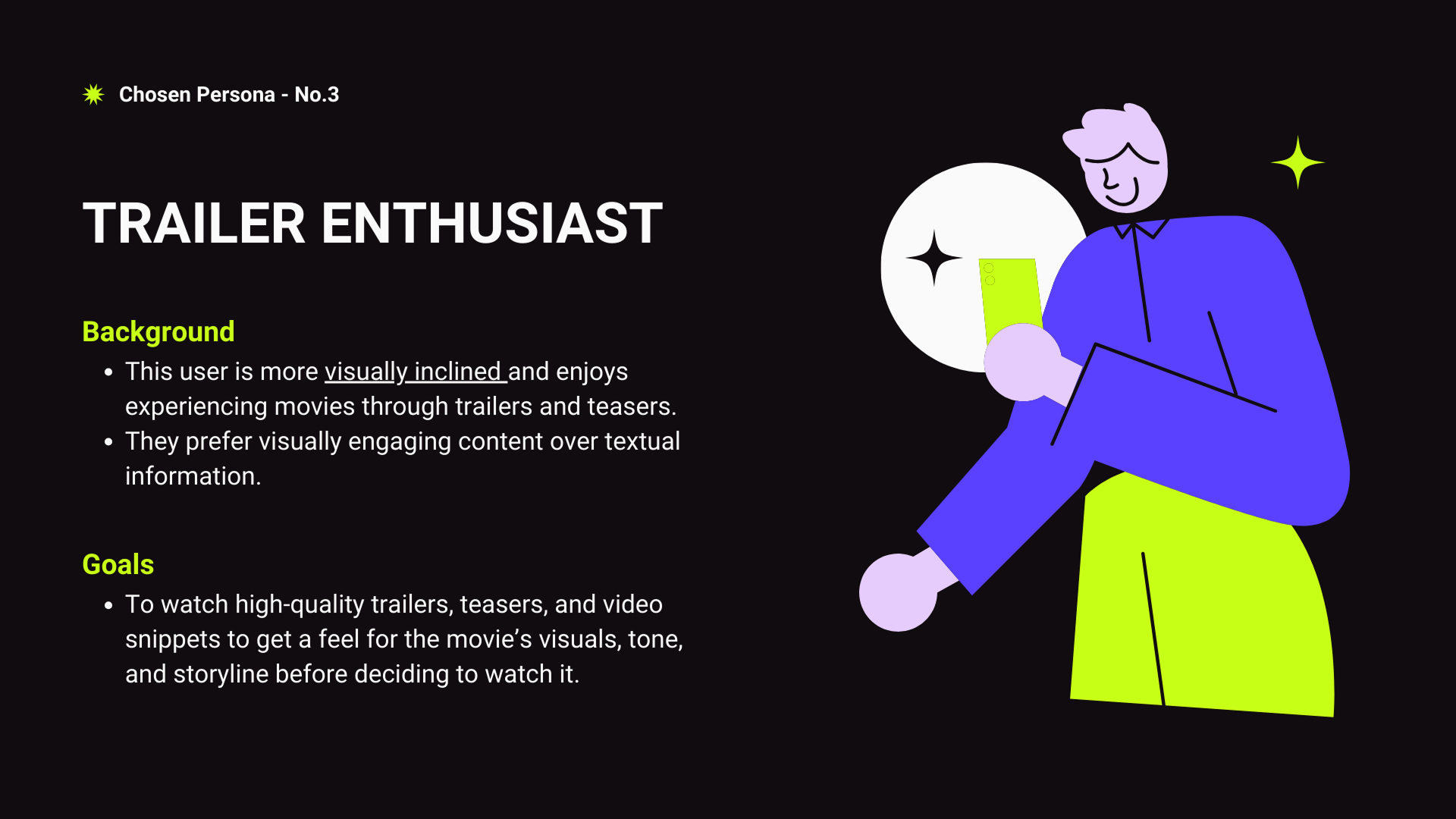
Trailer Enthusiast
why choose this persona ?
background
I selected the Trailer Enthusiast because their needs align closely with what users typically expect from a movie-metadata experience: immediate access to engaging visual content that helps them understand the tone, storyline, and mood of a film before reading deeper details.
This persona also introduced a meaningful usability challenge - avoiding cognitive overload from dense, text-heavy layouts.
Goals
Design a responsive movie detail page that presents key information clearly and visually.
Reduce cognitive load for the Trailer Enthusiast while maintaining consistency and usability across desktop, tablet, and mobile.
initial Sketches
low - fidelity
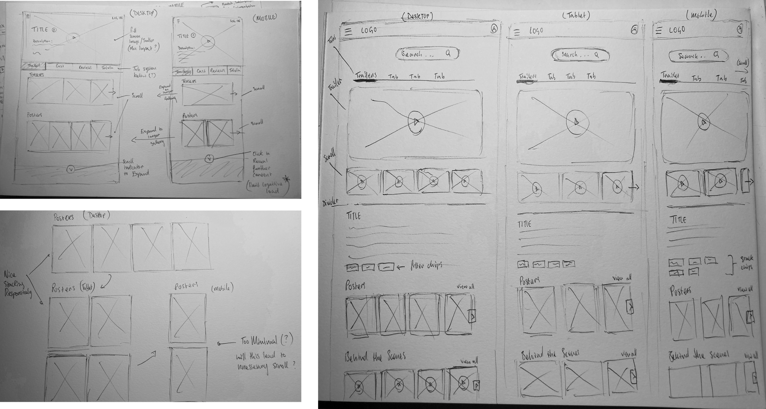
I explored different layouts and how the elements would move when switching between devices to decide which format would be the most effective for my design.
I decided this was the most effective design showcased the visual elements in a carousel format.
I also added in descriptive chips that stack responsively and a tab system above the trailer for a more intuitive hierarchy.
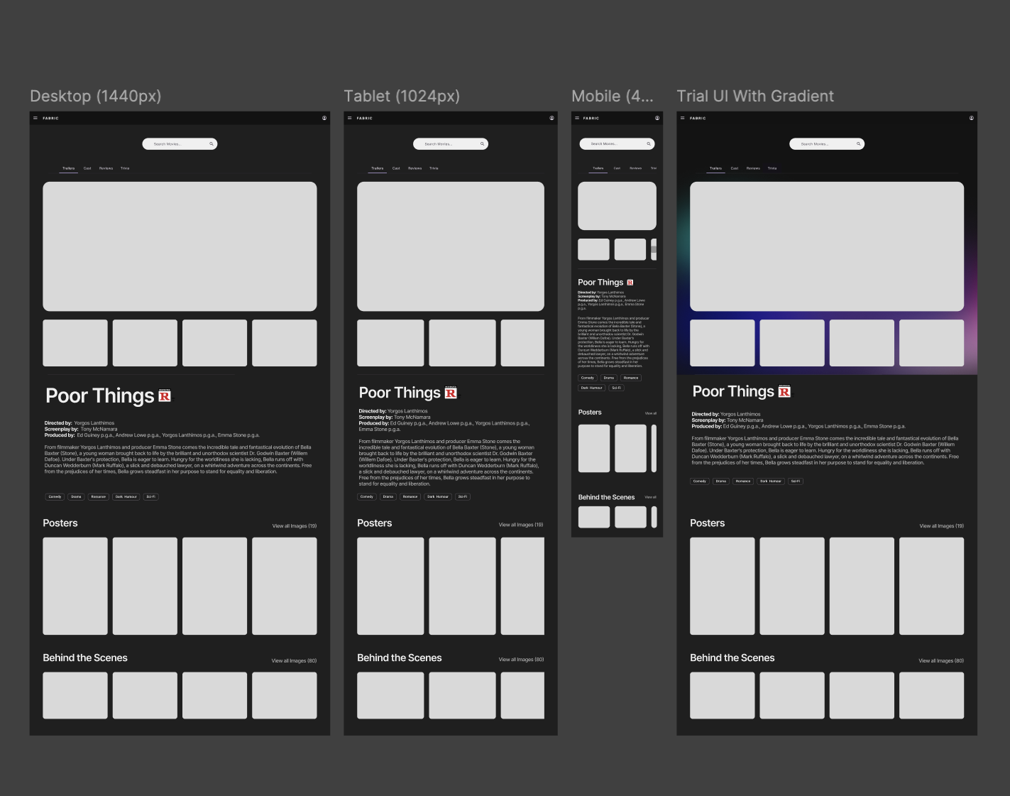
mid- fidelity
responsive wireframes
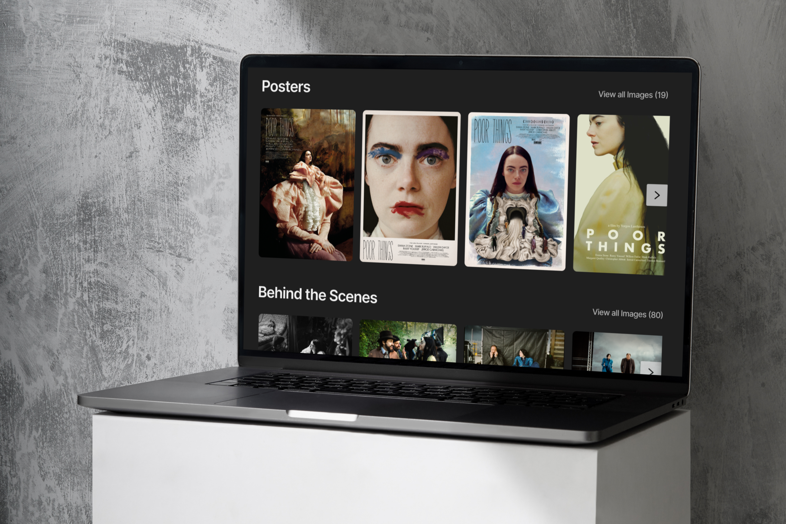
final design
high- fidelity
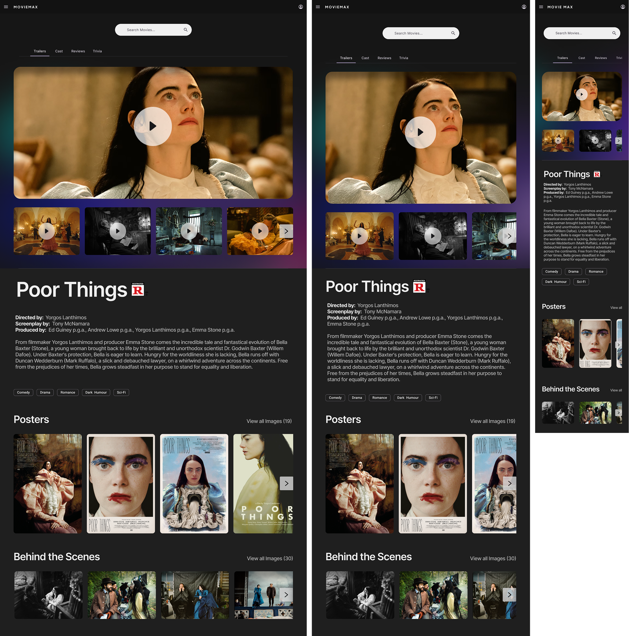
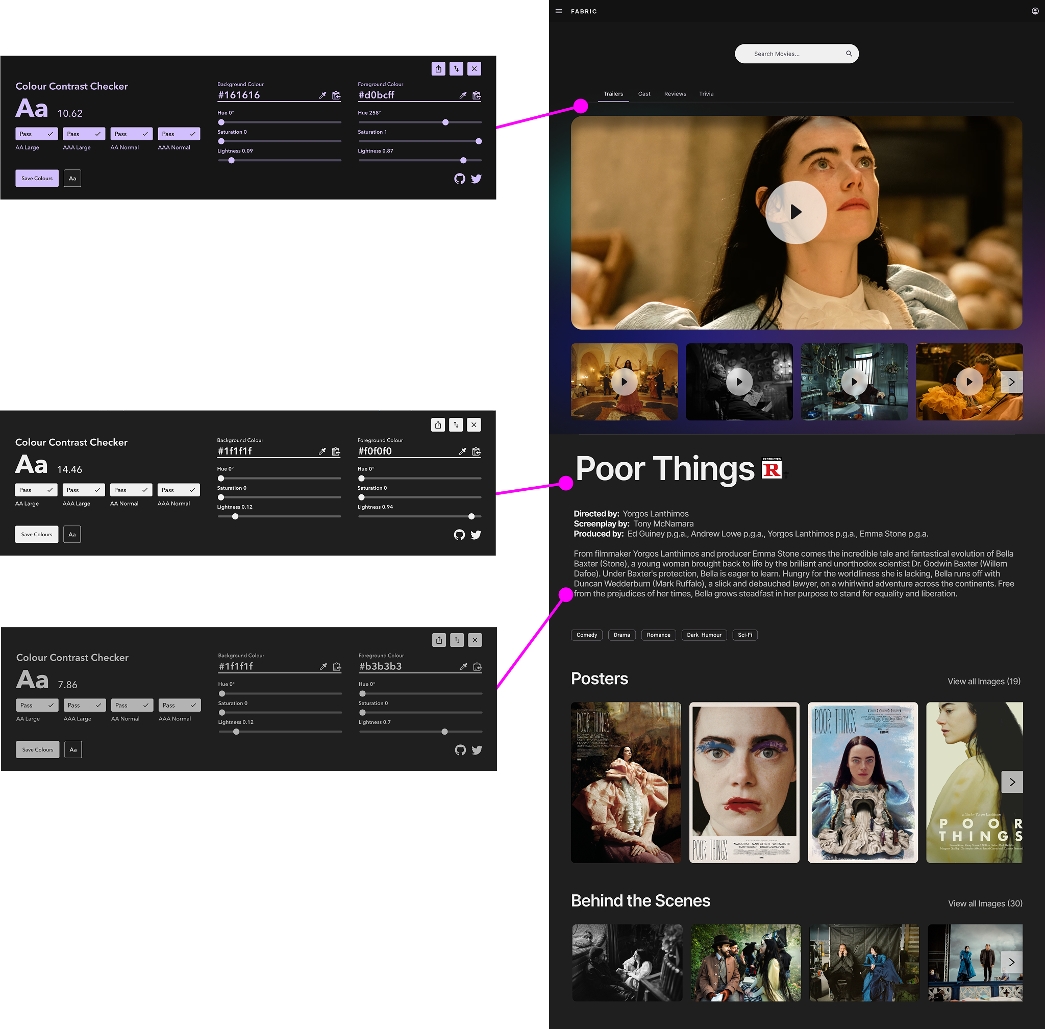
Accessibility check
When designing the UI, I considered visual strain and decided to create my design in “Dark mode” as this would aid my user to further focus on the content itself whilst relieving any unnecessary strain from bright interfaces.
The “Dark mode” colours used were contrast checked to ensure they reached an AA and AAA standard as well as maintaining a font size above 16pts throughout.
reflections.
This challenge gave me the opportunity to practice making clear design decisions within tight constraints. Designing for the Trailer Enthusiast reinforced the importance of visual hierarchy and reducing cognitive load, especially when working with dense content.
I also strengthened my approach to responsive design, ensuring the experience felt intuitive and consistent across desktop, tablet, and mobile.
Overall, the project sharpened my ability to work quickly, think systematically, and translate user needs into a cohesive, visual-first interface.